Sometimes i get emails with the suggestion: „Please add a graphical representation of the current week to ‚Week View‚, like the one that MS Outlook has“.
While i agree that a graphical week view like outlook makes sense on a large pc/notebook/tablet screen i don’t think it’s a good idea on a smartphone display.
I want to compare the view of the current week of my app ‚Week View‘ with another app that uses a graphical week representation so you can judge yourself.
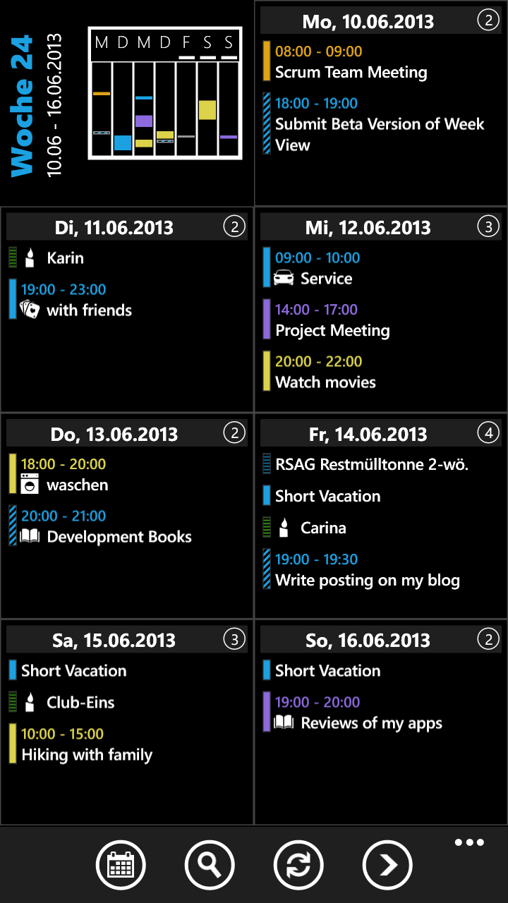
This is how a week is visualized in ‚Week View‚ (please click on the image to enlarge it):
My goals for creating the ‚week view‘ were
- Provide a clean, easy to read view of your appointments
- The text of all appointments should be readable
- A user should see all appointments of the week, without the need for scrolling
- If you have more appointments that overlap in time (for example from a shared calendar) they should both be readable
- Allow the user to see ‚free time‘ between his appointments. This can be done in the ’small week overview‘ on the top, left side
- Support for portrait and landscape view (the screenshot is in portrait view)
- View details with 1 tap (simply tap on the appointment to see it’s details)
This is the ‚portrait view‘, a ‚landscape view‘ is supported too of course. By tapping on a ‚day‘ you get to a ‚day view‘ where you can see details from the appointments on this day or add/edit/delete appointments.
Now lets look at an app that uses a graphical representation, like outlook does. There are some of them in the marketplace, i have chosen ‚VsysCalendar WP8‘ for this comparison.
Here is, how a graphical representation of the same week looks like in ‚VsysCalendar WP8‘:
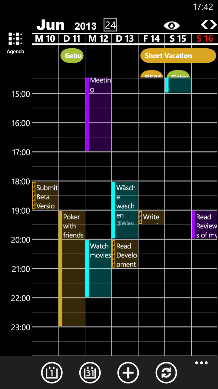
Important: This is only a comparison of a graphical week view with the view that is used by ‚Week View‘. This is not a comparison of 2 apps.
In my personal opinion the graphical week view has some disadvantages
- Not all appointments of the current week are visible, for example all appointments that start before 2pm are not visible on the screenshot
- The user has to scroll up and down to see all appointments of the current week
- The all day appointments are not completely visible
- The subject text of the appointments is truncated. This gets even worse, when overlapping appointments exist, like on the screenshot below.
Can you see your appointments here? 😉
(This screenshot is NOT from ‚Week View‘)
So this is the reason why at the moment creating a graphical representation of the current week is not a high priority task for me. If you have a different opinion or other suggestions, please let me know! 🙂
Die Wochenübersicht finde ich gut und v.a. übersichtlich genug, das Konzept ist in meinen Augen stimmiger als bei anderen Apps.
Mir fehlt nur eine Integration der Aufgaben-Funktion, damit ich nicht extra eine andere App starten muss.
Gruß,
JT
Hallo,
ich würde die Aufgaben sehr gerne integrieren – leider gibt es für diese seitens MS keine Programmierschnittstelle.
Das ist auch der Grund, warum es im Marketplace keine einzige App gibt, welche die Aufgaben bearbeiten kann.
Ich hoffe selbst, dass MS die Programmierschnittstelle erweitert – sobald das der Fall ist, werde ich die Aufgaben in Week View integrieren.
lg
Hannes
Die graphical representation finde ich sehr wichtig, die vorgebrachten Argumente finde ich unzureichend, in Outlook habe ich seit fast 10 Jahren die Möglichkeit die Ansicht umzustellen. Ich denke die meisten nutzen die grafische wochenansicht. Ich lebe mit dieser und vermisse diese bei WV8 so sehr das ich dies als echten mangel sehe
Hallo Kaepten,
auch ich verwende Outlook seit > 10 Jahren und stimme völlig zu: Die grafische Ansicht ist sehr übersichtlich und gut verwendbar – auf einem PC/Notebook.
Auf einem Smartphone mit 4″ Bildschirm ist diese m.M.n. unbrauchbar. Gründe, warum ich das so sehe, habe ich im Artikel http://www.hannesbiribauer.com/wordpress/?p=221 beschrieben.
Welche Ansicht (Woche/Monat) hätten Sie gerne als grafische Darstellung?
Derzeit überlege ich, eine grafische Monatsansicht als Option bereitzustellen.
Für Detaildiskussionen möchte ich Sie bitten, mich unter meiner Support-EMail Adresse zu kontaktieren, welche in Week View hinterlegt ist.
freundliche Grüße
Hannes
I would actually love to see a view like this… However, I would it to be automated for landscape view with a vertical scroll. I love the calendar but would like to see a view like this when the phone is rotated.
hi,
as written in my posting – i tried some apps that provide a view like this + i don’t think they provide a good overview. What works well on a >10″ screen (tablet, notebook, …) does not work that well on a much smaller phone screen. Just scaling all down makes the font size super small + unreadable. I do not plan a view like this graphical representation in the future – for an overview or searching for „free space between the appointments“ the small week overview can be used. What i am thinking about: A month view with a more graphical representation to better visualize appointments that span multiple days. But at the moment these are only thought what can be done and maybe is helpful. 🙂
The graphical week view of the competitor makes sense in case of multiple short appointment during a day. We use one entry every 30 Minutes. The text might not be readable, but you can easily find gaps in the schedule for filling them. This is a hard job with the current week view.
Maybe you can spread the columns for displaying 3 to 4 days and let the user scroll horizontal.
Grüße aus Kiel, Dirk
Hi Dirk,
thank you for your suggestion!
„Finding gaps“ in fact is easier with a graphical representation of appointments.
This is the idea of the „small overview“ on top of the week view main screen.
A graphical representation would be the same thing – only bigger. 🙂
I prefer seeing the whole week without the need for scrolling around to see your appointments.
A graphical representation is on my list as a 2nd view but at the moment it has low priority.